A perturbed slew of Android users has been slamming Google’s all-new mobile operating system after sudden changes were rolled out The new UI update has added to the fury of many, as the abrupt shift has left users searching for controls similar to the older interface.
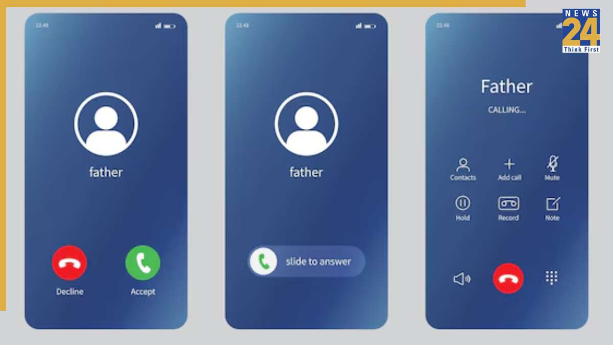
The new interface, with its oversized buttons for call end, keypad, mute, and speaker options, has left users lurching. The phone app, contacts, and call lists have also been tweaked, with horizontal lines now separating each contact and the last dialed numbers.
The changes make the interface resemble iOS, with a slide button now required to answer or decline an incoming call. These modifications have apparently appeared despite users not downloading any update on their devices.
While the changes were aimed at enhancing clarity between each contact in the user list, many argue the contact list was already clean enough. The separating lines between contacts feel unnecessary, even jarring.
The new huge call buttons make the overall appearance seem over the top and in your face.
Social media platforms are flooded with posts about how the new interface looks oversized and ugly.
A few users have shared a workaround for the swipe feature, explaining that under “Incoming call gestures” in phone settings, one can revert to “Single tap,” which was the default option earlier. However, the other changes don’t appear to have a workaround yet.


